Top Ten Trends For Website Design In 2021
1. Digital Illustrations
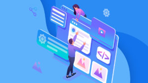
Digital illustrations are created using Adobe Photoshop to develop an image that tells a story, brings out an emotion, or sells a concept. Using a creative brief from a client, a digital illustrator generates unique artwork to help pass a message or sell a product. With the help of web design experts like Maze, you can have these digital illustrations created for your website. The benefits of illustrations include:
- Making your content more attractive
- Adding an element of humor
- Saving time
This feature can be applied in a wide variety of fields including Advertising, commercial products, editorials, books, book covers etc.
2. Video Headers
Video headers independently tell your brand story and can be used together with other homepage elements to take brand storytelling to a different level. Below are tips on using video headers:
Ensure it resonates with your brand
- Use high-resolution videos
- Keep it short
- Tell a story
- The video and page text should be in contrast
- Use the mute by default setting on your videos
- Incorporate Para scrolling
- Confirm browser compatibility
3. Split Screen
A split-screen layout divides full-screen elements into two or more vertical sections, and when done correctly, it offers a magical viewing experience. This design perfectly suits minimalist web designs and landing pages as they aren’t overloaded with bold elements. The benefits of split-screen web design include:
- Creating a common experience for mobile and desktop users
- Creating unique visuals to differentiate web content
- Making websites visually appealing
- It falls under-responsive web designs
- You can apply it to any web theme
4. Colors that stand out
The colors you choose for your web design are critical in determining feel, target demographic appeal, and creating a unique logo.
Here are reasons why colors are beneficial for your web design:
- Unique colors boost brand recognition by influencing the way people perceive your business.
- CTA buttons with the highest color contrast encourage visitors to convert
- Colors help you draw attention to areas that you want your visitors to focus on
- They influence people’s feelings about your brand.
5. Retro fonts
We’ve seen many old things become cool again, and then in turn become even more uncool.
Retro fonts have experienced this same ebb and flow in their popularity, and many designs featuring vintage typography haven’t aged well.
However, throwback typography has gone through a bit of a resurgence. We’re not seeing the same tired fonts. Rather, stylization and a bit of artistry are reimagining what retro fonts can be.
We see this merging of old and new on the page for Spotify’s Carnival promotion. Instead of feeling stale and cliche, they breathe new life into traditional bold fonts with a bit of experimentation. This is a good example of taking traditional fonts and giving them a bit of a cool and modern spin while maintaining legibility.
6. Horizontal scrolling
We’re seeing more web designers continuing to experiment with horizontal scroll. Those who do it best break the pattern not for the sake of being different but as a practical way to disclose secondary information progressively, like in an image gallery.
Designers employing horizontal scroll successfully in 2021 will keep in mind these considerations:
- Don’t force users to navigate through horizontal content: allow alternate ways to navigate, like arrow buttons with clear labels.
- Use clear visual cues to indicate where content uses horizontal scroll, and don’t hide these cues behind hovers.
- Be thoughtful about what content would benefit from being displayed in a horizontal scroll — a photo gallery is a good contender as a horizontal scroll would show users a small preview, and allow them the option to view more or keep moving down the page.
- Avoid requiring a horizontal scroll for the text that needs to be read.
7. 3D Visuals
With the advent of higher resolution screens, 3D design has come a long way from the blocky and bevelled edges of GeoCities. We’ve been seeing high-quality 3D visuals weaved seamlessly into web designs. Instead of being garish distractions, they’re adding to the overall user experience.
The creative agency Sennep throws in dashes of depth with 3D elements throughout their website. There’s a nice sense of harmony here between all of the design elements. This is a perfect example of how in more minimalist layouts, 3D can make an even bigger impression.
8. Multimedia experiences
With most people having access to faster internet speeds multimedia web experiences are popping up everywhere. Bringing together visuals, text, video, and audio makes for a rich user experience.
Successful designs in 2021 will use constraint with multimedia experiences:
- Prioritize simplicity, like when combining motion and audio. Too much going on can be distracting or overwhelming to people with cognitive disorders.
- Use different media formats thoughtfully to maximize the accessibility of content.
- Include closed captioning and transcripts for all pre-recorded multimedia.
- Include alt text for images and accompany complex images with longer descriptive text.
- Ensure that all text is made with HTML rather than rendered inside images.
- Avoid auto-playing video or motion content: instead, provide a clear “play” button that affords the user the option to play and pause the content
9. Muted Colors
Minimalism is a trend of the 21st century, a lot of people consider it to be the design trend of the future, its simplistic design may appear easy to construct on the first appearance, however, mastering the art of minimalism takes a lot of time and effort.
One key aspect of this new trend is to focus on muted colors, this term refers to simple and plain colors which are not catchy, but rather give off a warm vibe, rather than being attractive, they give off the sense of being warm and cosy, thereby giving the user/customer a feeling of comfort and trust.
The use of muted colors as backdrops has been on the rise in the professional web-development industry, with more and more companies, especially those who deal with services using them to create a sense of trust in customers.
Magic Theater Studio, uses a light color palette, along with dark blocks of green, making for a distinct contrast between sections of this web design. These muted colors are the perfect backdrop to the hand-drawn styled text and illustrations. In the background, there’s a slightly buzzing grain that’s almost indiscernible, and a subtle distortion to the light and dark backgrounds, making the design feel very much alive.
10. Use of “Dark Mode”
A lot of Graphical user interface nowadays uses “dark mode” as an alternative to its default look and feel, it is an in-built feature of the graphical interface which gives users the option to use darker colors, as not everybody likes to look at bright white screens, it also lowers the battery consumption of the device on which it is being viewed on.
More designers are embracing the dark mode aesthetic, with black providing the perfect dark backdrop to make design elements pop from the screen.


